Overview
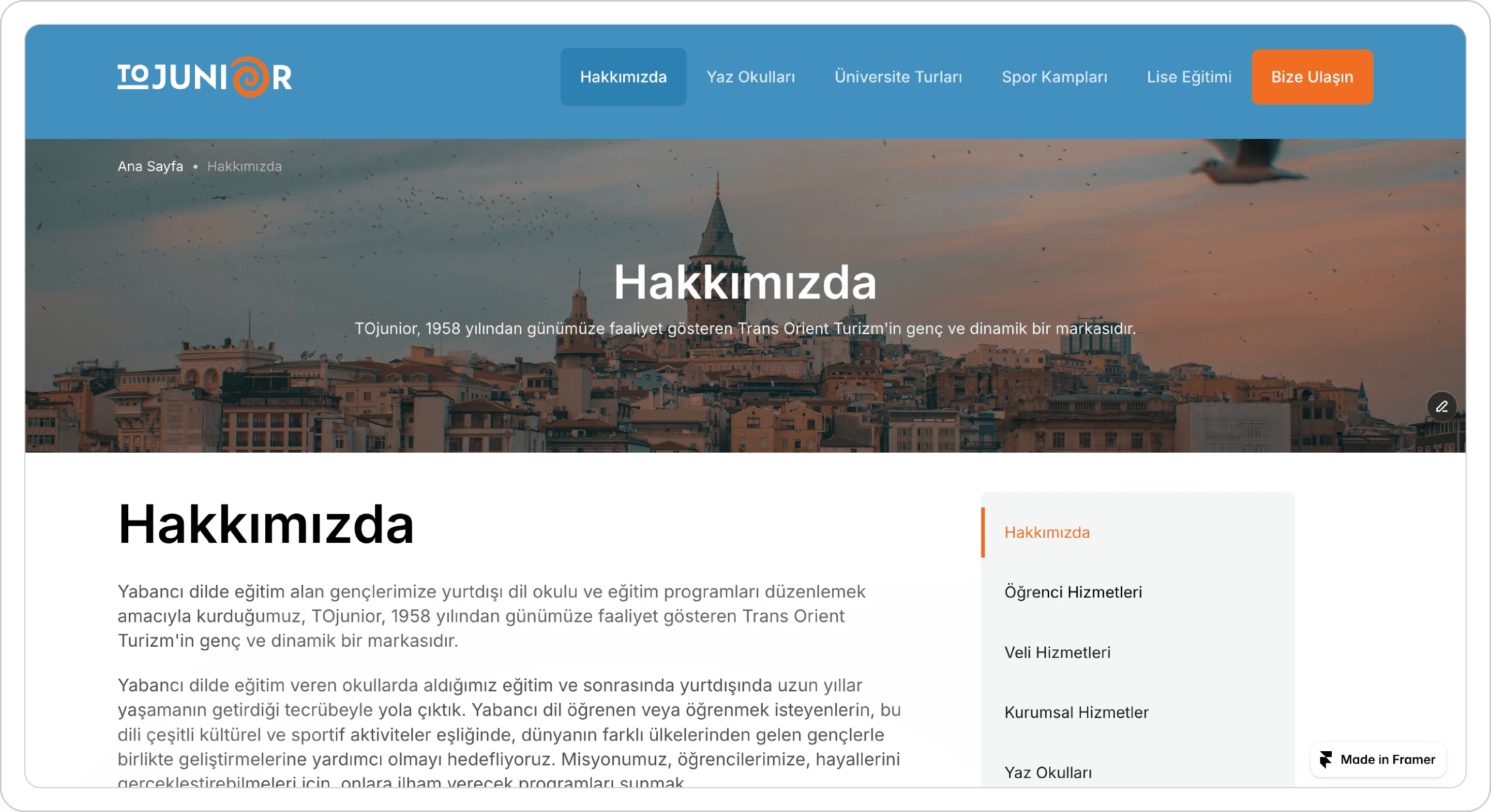
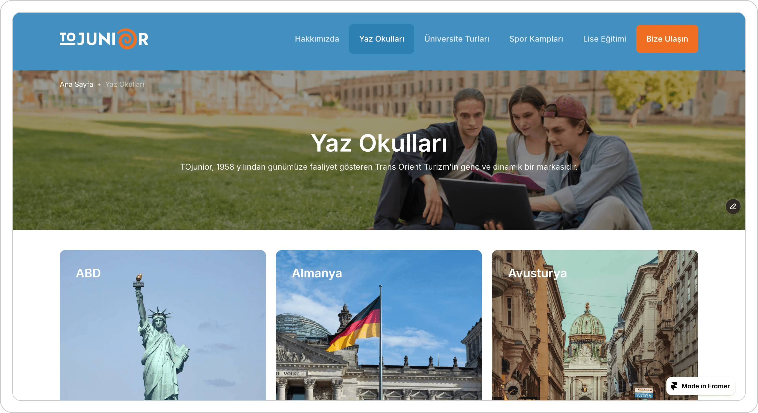
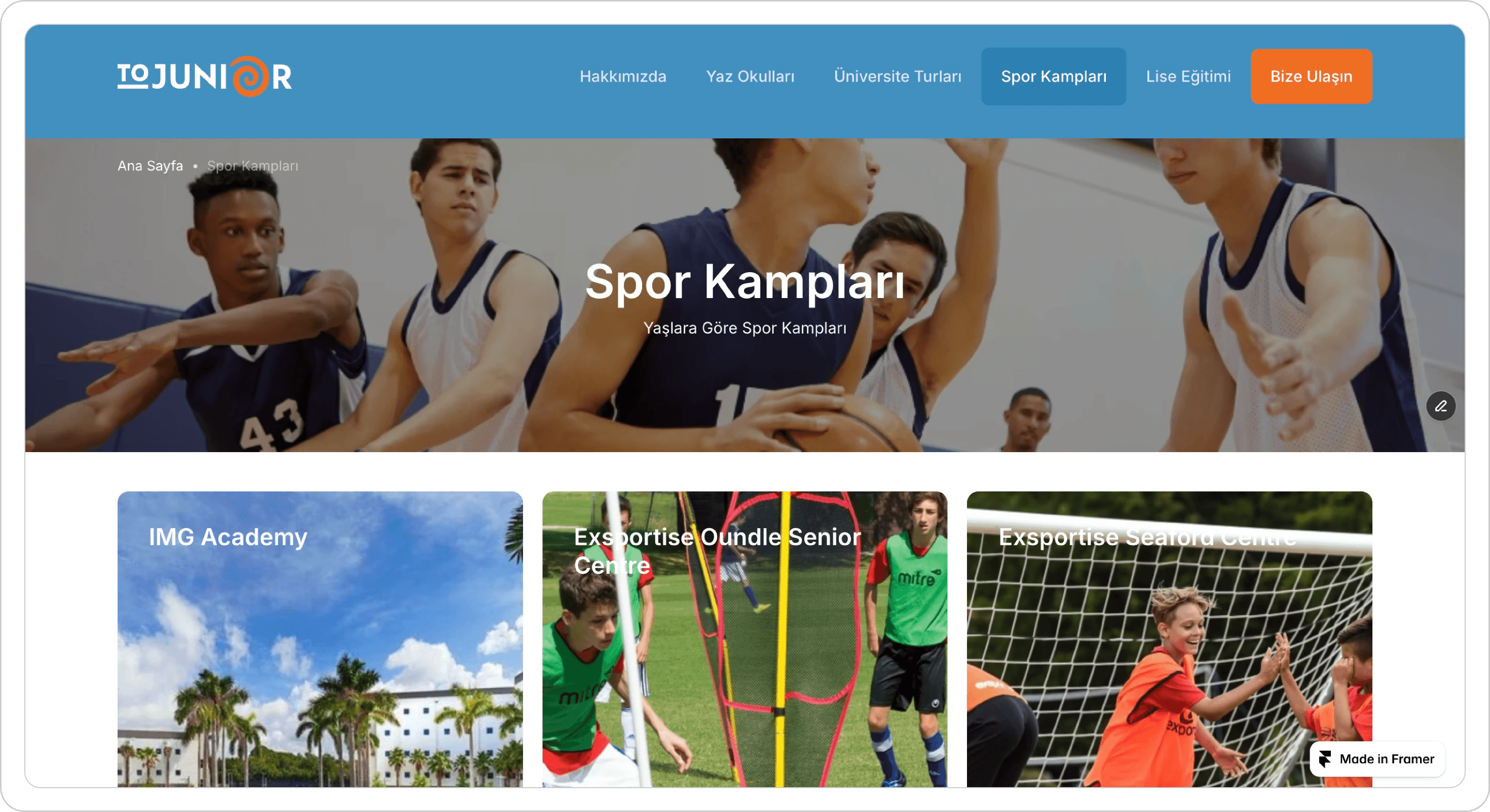
While redesigning the Summer School Travel Program website, I focused on creating a clear, engaging, and student-friendly experience. The original site lacked structure, consistency, and modern appeal, which made navigation difficult and the content harder to understand.
To improve the overall experience, I redesigned the interface in Framer using a new layout, stronger visual hierarchy, and a mobile-first approach. I simplified the page flow, improved readability, and created cleaner sections that guide users naturally from one part of the site to another.
Throughout the project, I worked on better spacing, updated typography, and reusable components to keep the design organized and easy to maintain. The result is a more modern, accessible, and visually appealing website that makes the program information easier to explore for students and parents.